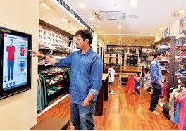
 In the world of omnipresent screens and multi-screening consumer behavior, marketers of the Middle East are experiencing a pressing challenge to decipher specific roles for screens at different touchpoints and in various consumer moments. Everyone insists that screens are indispensable because they are the gateway to access desirable content and perform necessary actions. On the other hand, in physical retail environment they seem redundant because mobile phones have taken the leading role in assisting people in searching, shopping and sharing. Inspired by global best practices, Middle East retailers debate the importance of screens and encourage brands to rethink what screens can do for them in the brick-and-mortar retail context.
Cheil Dubai planning team hit the stores with an audit to evaluate to what extent brands and retailers leverage on the capabilities of digital displays. A quick walk through a mall helped to uncover several inspiring best practices along with a couple of epic fails. Here is a review of five screens that attracted our attention and gave us food for thought.
McDonald’s self-service kiosk. In the second half of last year McDonald’s introduced self-service order kiosks. Each kiosk consists of a large touch screen and a payment machine. With a few simple steps customers choose or create the options they like, pay and pick up the order from the counter. According to the McDonald’s staff the kiosks have enjoyed instant success – about 50% of customers now prefer to use the self-service machines to ordering at the counter. Why does it work? Because the kiosk has a clear role in the shopping process. It goes beyond displaying appetizing burgers on the screen. It assists customers in choosing what they like and placing an order in the most efficient way, making sure nothing is lost in translation.
Reel cinemas trailer screen. Very often the decision to watch a movie is made on the spur of the moment when you are already in the mall. But which film to go for? This is when mobile phones come in handy – reviews are quickly checked and trailers are watched. Reel cinema turned this observation into a solution. Next to the box office they placed a large screen showing trailers of the movies that are on. First, it helps people to make up their mind, and second, it triggers the impulse for those who were not planning to go to the cinema.
Mars periscopes in Carrefour. With its conceptual design Mars has transformed the chocolate aisle of Carrefour into Chocolate Factory. Periscope-like looking devices were installed in the aisle to tap into the playful mood of chocolate shoppers and invite them to discover brands and products. Inside each device there is a small screen with a product demo. Although the content could be much more exciting, the idea to disguise the screens as periscopes is brilliant. Curiosity will not let you ignore them.
A massage chair demo. One of the sports stores is offering a massage chair. The chair is on display and shoppers are welcome to try it. High above the chair there is a small screen playing a product demo with some narrative by a person in a lab coat. The VO drowns in the ambient music of the store. In its current function the screen adds no value to the shopper. It is redundant because what can be better than the actual tactile first hand product experience? With a bit more thought it could be transformed into a review portal where shoppers who tried the chair could share their feedback.
Snickers promo display. A prime location in the beginning of the chocolate aisle is taken by Snickers special display. A nicely branded display unit brings the new extra caramel variant to the shoppers’ attention before they enter the aisle and face hundreds of other options. The screen, which is the focal point of the installation, disappoints shoppers with its content showing winners of a recent promotion receiving their prizes. There is no sound or messaging and the production quality is poor. For the brand this turns out to be an expensive missed opportunity that could have been used to fast-track shoppers’ purchase decisions.
Drawing from the described examples, here is a starter kit of five tips for those who want to make screens work harder in the retail environment.
1.Have a clear idea of which existing behavior the screen is facilitating or if it is prompting any new behavior that can aid purchase decisions.
2.Do not accept as a given that a screen has to be flat and rectangular. Find a way to make it part of a creative concept and dress it up.
3.Consider the optimal distance between the screen and the viewer to ensure the content or message does not get lost. If the budget does not allow the right size, maybe it is better to look for other tools.
4.Design ‘mute-proof’ content. Very often sound or voiceover would disagree with the overall environment and will have to be turned off. News channels and Facebook videos are successfully talking to their audiences without sound, so can you.
5.Finally, rather than playing your product demos and TV ads, tailor-make content to be relevant to the audience and their current mindset. Make it interactive, if that helps to progress customers towards making a purchase decision. At the end of the day a simple screen today can be so much more that just ‘a flat panel or area on an electronic device on which images and data are displayed (Wikipedia)’.
During our quest for interesting digital display solutions, we uncovered a few occasions where screens could help tackle real shopper barriers that have not yet been addressed.
The first one is ready-to-eat and ready-to-cook meals in a supermarket frozen food aisle. Hidden in the cold section, locked behind freezer doors and packed away in boxes frozen meals are deprived of any chances to talk to shoppers’ senses and arouse appetite. A digital interactive display at the entrance to the aisle could help people explore and evaluate the frozen food options before they enter the chilly aisle to pick up the chosen product.
Another opportunity is apparent with more and more people wanting to read the labels on food items. Not everyone has perfect eyesight and reaching out for reading glasses every time is an inconvenience. Digital display technology could help shoppers magnify important information on food labels. This would make the shopping process more efficient and less frustrating.
In conclusion, let’s not forget that a screen by itself is not a creative idea. It is only a piece of technology, a gadget that can become a powerful communication tool in the hands of a skillful marketer. What counts is how this tool transforms into a solution to people’s needs and becomes instrumental in accomplishing their shopping missions.
Authored by Olga Kudryashova, Head of Strategic Planning, Cheil MENA


